CREATION
Strange Company Starts Here
Strange Bedfellows began as an exercise in unexpected pairings: old and new, refined and irreverent, beautiful and a little inappropriate.
I developed the concept as a modern aperitivo and wine bar with its own bottle shop, house wines, merchandise, and visual world.
The identity draws from vintage natural-history engravings, European wine ephemera, and traditional serif typography, disrupted by bold red graphics, suggestive illustrations, and an intentionally mischievous tone.
The result is a brand that feels established without feeling traditional—somewhere between an old-world wine label and something you probably shouldn’t show your grandmother.
BRANDING
Logo Variations

Primary Logo — Stacked Lockup
The primary Strange Bedfellows identity, pairing the signature rabbit illustration with a stacked serif wordmark, establishment date, and full business descriptor.

Illustration Mark
The signature rabbit pairing serves as a recognizable standalone brand element, extending the identity beyond the primary logo system.

Circular Badge - Primary
A self-contained emblem combining the rabbit illustration, brand name, establishment date, and business descriptor. Ideal for stamps, stickers, coasters, and packaging.

Illustrated Monogram Badge
A compact combination of the standing rabbit and SB monogram, designed for narrow formats, merchandise, labels, and secondary brand moments.

Ornamental Seal — Primary Rabbits
A more formal decorative crest combining the primary rabbit pairing with botanical and fruit engravings inspired by traditional wine packaging.

Secondary Logo — Illustrated Wordmark
A horizontal variation of the primary identity, combining the signature rabbit illustration with the Strange Bedfellows wordmark and business descriptor.

Wordmark
A typography-led variation that removes the illustration for a cleaner, more editorial expression of the brand.

Circular Badge - Alternate
A simplified red-and-black variation of the primary badge that introduces the brand’s accent color for more expressive applications.

SB Monogram
The simplest expression of the identity. The intertwined initials create a recognizable brand mark for small-scale applications where the full logo would be unnecessary.

Ornamental Seal — Alternate Rabbit
A decorative framed variation featuring the more mischievous rabbit illustration, emphasizing the brand’s humor and vintage visual language.


CHALLENGE
A Little Refined. A Little Unhinged.
The challenge was finding the line between sophistication and absurdity. Wine branding often lives at one of two extremes: highly traditional or aggressively trendy. Strange Bedfellows needed to feel neither.
I built the identity around contrast. Detailed engraved illustrations sit against oversized contemporary typography. A restrained cream, black, and red palette keeps provocative imagery feeling intentional. Classical layouts are interrupted by unexpected compositions and copy.
Every decision follows the same principle: take the wine seriously, but never take the brand too seriously.


Because good taste doesn’t have to mean good behavior.
Perfectly Improper
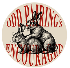
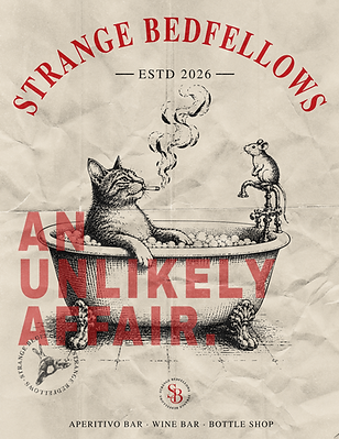
The humor of Strange Bedfellows isn’t an afterthought—it’s part of the brand system. Rabbits caught in compromising positions, cats behaving badly, suggestive pairings, and phrases like Keep Strange Company and Pairs Well With Bad Decisions give the identity its personality.
Rather than relying on explicit shock value, the brand plays with implication. The illustrations borrow the authority of antique scientific engravings, then place their subjects in situations that are anything but academic.
That tension became one of the most recognizable parts of the identity: beautiful enough to look twice, strange enough to make you laugh when you do.


THE MENU
Odd Pairings Encouraged
The menu system carries the personality of Strange Bedfellows directly to the table. Wines are organized by attitude rather than intimidating tasting terminology, with categories like Bright & Badly Behaved, Pretty & Complicated, Dark & Questionable, and Bubbled, Obviously.
This makes exploring wine feel approachable while reinforcing the brand voice at every point of interaction.
The rotating pairing wheel turns choosing a wine into a tactile interaction. Guests can spin through wines, flavor profiles, and suggested pairings rather than simply reading down a traditional menu.
Inspired by vintage volvelles, fortune wheels, and analog reference tools, the piece adds an element of discovery to the table—and gives guests permission to let chance make the decision.


MOCKUPS
Keep Strange Company
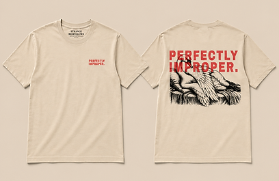
Strange Bedfellows was designed as a complete hospitality experience rather than a logo applied to a collection of objects. The identity extends across wine bottles, menus, matchbooks, coasters, posters, shopping bags, wine boxes, signage, merchandise, and the physical bar itself.
Each application shifts the balance between refined and irreverent while remaining unmistakably part of the same world. Oversized typography becomes environmental signage. Engraved illustrations turn into collectible objects. Packaging feels just as considered sitting on a retail shelf as it does scattered across a table after a long night.
Together, the touchpoints create a brand meant to be ordered, opened, handled, photographed, taken home—and remembered.