


CREATION
About Pachamama
Pachamama is a tropical beach bar and restaurant located in Colombia, South America. While living abroad, I partnered with the brand to create a full visual rebrand inspired by the culture, energy, and natural beauty of the surrounding coastline.
The name Pachamama comes from the Indigenous Andean goddess representing Mother Earth — a symbol of nature, abundance, nourishment, and connection to the land. That meaning became the foundation of the creative direction. The identity was designed to feel earthy yet elevated, balancing organic textures and tropical influences with a modern, editorial approach.
The project included a refreshed brand identity, menu design, event promotions, social media assets, and large-format visuals used throughout the space. Every touchpoint was created to feel immersive and cohesive, reflecting both the relaxed atmosphere of the restaurant and the vibrant nightlife culture it transformed into after dark.
The final rebrand helped position Pachamama as more than just a restaurant — it became an experience rooted in atmosphere, storytelling, and place.
CHALLENGE
A Bilingual Brand Experience
One of the biggest challenges of this rebrand was designing for both local Spanish-speaking guests and the large number of English-speaking tourists visiting the area.
I redesigned the entire menu system from the ground up, translating and restructuring content to feel natural and cohesive in both languages while preserving the warmth and personality of the original brand.
The goal was to create an experience that felt accessible, immersive, and authentic for everyone walking into the space.


BRANDING
Logo Variations
Primary Logo

Sun & Sea Symbolism
This logo uses a hand-drawn sun rising over ocean waves to represent Pachamama’s connection to nature, warmth, and the laid-back coastal atmosphere of the Colombian shoreline.
Wordmark

Tropical Storytelling
The wordmark combines hand-drawn tropical iconography with earthy typography to reflect Pachamama’s connection to nature, travel, and the vibrant culture of coastal Colombia.
Submark 1

Coastal Seal Emblem
Inspired by the Colombian coastline, this circular submark combines the sun and ocean waves to capture the atmosphere of Pachamama’s beachside experience. The design was created to function as a versatile supporting asset across menus, merchandise, packaging, and social media.
Submark 2

Solar Emblem
This standalone sun illustration was designed as a symbolic brand mark representing warmth, energy, and Pachamama’s connection to nature and spirituality. Its hand-drawn texture and organic imperfections reinforce the relaxed, artisanal feel of the overall identity system.
ICONS


Illustrated Icon System
A custom set of hand-drawn icons was created to expand the Pachamama identity system across menus, packaging, social media, and environmental branding. Inspired by local food, coastal landscapes, and Colombian culture, the icons were designed to add personality, improve menu navigation, and create a cohesive visual language throughout the brand experience.
BRANDING

Type Pairings & Colorways

Primary Colors

#f4ebd5

#ba6e29
Secondary Colors

#803d1d

#ae5626



SOCIAL MEDIA REFRESH
@pachamama
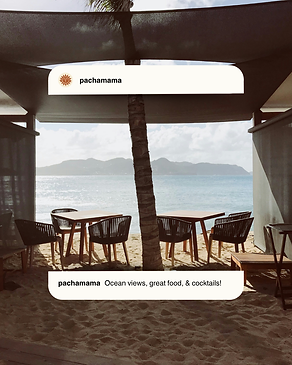
As part of the rebrand, I redesigned Pachamama’s social media presence to create a cohesive digital identity that reflected the atmosphere of the restaurant and beach bar experience. The goal was to make the brand feel immersive online — capturing the warmth, culture, food, and laid-back energy of the Colombian coastline through a curated visual system.
I created a variety of branded still posts, carousel graphics, promotional content, and menu-focused designs that introduced the new identity across Instagram. The content strategy blended food photography, cocktail imagery, environmental shots of the restaurant, and branded graphics to create a feed that felt both elevated and approachable. Carousel posts were used to showcase menu items, specials, and experiences in a more engaging storytelling format, while still graphics helped reinforce the new branding through typography, illustrations, and iconography.
Using the updated brand system, I also designed social templates that incorporated the custom icons, earthy color palette, and handcrafted textures developed throughout the rebrand. The final feed functioned as an extension of the physical space — allowing guests and travelers to immediately understand the vibe, atmosphere, and experience Pachamama offered before ever visiting in person.
DELIVERABLES
Brand Applications
The Pachamama identity was designed to extend beyond the logo system into every part of the customer experience.
From menu layouts and environmental signage to branded apparel and merchandise, each application was created to feel cohesive, immersive, and reflective of the restaurant’s tropical coastal atmosphere.
The result was a flexible visual system that could live seamlessly across both print and physical spaces.
