


CREATION
About MOBA
My rebrand for The Museum of Bad Art was a project I completed in 2022 as part of a University assignment. The museum itself is most known for its crude artwork, sarcastic voice, and appreciation of what would typically be considered "bad art."
I brought all of these ideas into my branding for MOBA, and while it's creation was controversial due to the strict nature of my University, I knew that MOBA deserved a brand that would truly do it justice. While I received backlash from my school's administration for designing a brand that went against Christian values, I fought for the right to design a brand identity for a museum that is every bit as disruptive as I am.
While this project was ultimately removed from my senior show for it's perverse content, I inspired other students to go against the grain and design without limitation. It is, to this day, my most proud achievement.
CHALLENGE
Good "bad" design
The most challenging aspect of this project was to create a brand that was for "bad" art. Finding a visual direction that was engaging, true to MOBA's values - or lack thereof - proved to be a worthy challenge.
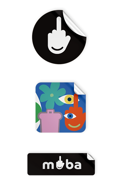
The essence of MOBA was to "flip the bird" at the art world, and so the brand became just that. A middle finger logo that says fuck you to anyone that deems themselves worthy to assign art to good or bad categories.
BRANDING
Logo Variations


Primary Logo
the little "o"
This variation of the logo replaces the letter “o” with our middle finger mark. It is to be used as the primary logo when the middle finger icon is not used by itself.


Secondary Logo
Primary Logo - version 2
Secondary Logo - version 2
the yuppie
This variation of the logo is to be used in more professional settings where the museum name needs to be seen in its entirety.


F-You
This is the official icon/mark of our brand. The middle finger icon portrays our crude tone of voice while the smile graphic makes it approachable and friendly.
F-You2
This variation of the logo is just as bold, but can still be seen on darker backgrounds and gives our logo system more versatility.
Icon/Submark
Icon/Submark - version 2


Tertiary Logos
Bloody-Mary
Blues-Clues
Purple-Haze
Devils-Lettuce
Piss-Poor
Blue-Balls
BRANDING

Type Pairings & Colorways


Primary Colors
#000000
#FFFFFF
Secondary Colors
#69ABA3


#8E8290
#D6A4C7


#60A164
#B0C587
#486AAF
#EDD873
#E28F3D
#B24636


FINAL PUBLICATION
MOBA Brand Guidelines
The final task in this project was to create a publication detailing the brand and it's applications. This publication is every bit as distasteful and entertaining as the elements you have witnessed already.
For more insight into this brand take a look at the full brand guidelines, or scroll through below.