


CREATION
A Joke Worth Designing
What started as a play on two very different meanings of “AI” became a small poster series celebrating the version I actually believe in: Adobe Illustrator.
The concept gave me an excuse to step away from client constraints and design purely for the fun of it—experimenting with oversized type, unexpected compositions, texture, and a little designer-specific humor.
CHALLENGE
Making AI Feel Human
The challenge was creating something that referenced the visual language surrounding artificial intelligence without feeling like it belonged to it.
Instead of polished gradients and futuristic imagery, I leaned into imperfection: pixelated edges, grain, hand-drawn marks, bold typography, and visible traces of the design process.
The result intentionally feels tactile, expressive, and made by hand—even when the tool is digital.




VISUAL LANGUAGE
Pixels, Points & Personality
The identity grew from a deliberately limited toolkit: hot pink, black, warm cream, and Illustrator orange paired with oversized typography and distorted raster textures.
Familiar pieces of the designer’s workspace—anchor points, bounding boxes, pen-tool imagery, cursors, and the Ai shorthand—became graphic elements of their own.
Across the series, those elements shift between polished and imperfect, creating a system that feels cohesive without making every poster look the same.


STICKERS/MERCH
Off the Artboard
The concept naturally extended beyond posters into objects that live in a designer’s everyday world.
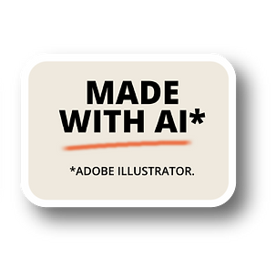
Stickers turn phrases like “Made With AI”* into small inside jokes, while Illustrator icons, pen-tool graphics, and campaign marks create a miniature collection designed for laptops, sketchbooks, notebooks, and studio spaces.
Taking the work off the artboard helped the idea feel less like a single punchline and more like its own little design-world—one made with AI, just not that AI.